When you kick off a new development project, it’s important to lay a solid foundation. Skipping this step might bring some initial success, but as the project grows larger and more complex, you’ll encounter issues along the way. Without a well-thought-out design system from the start, you’ll find yourself designing each component separately, leading to inconsistencies throughout the project. Plus, it’ll take more time and effort to code and style individual components.
On top of the extra effort required to code and style each individual components maintaining and updating the site becomes a real challenge without a design system. Let’s say you want to change the color scheme of your buttons or other UI elements. With a properly implemented design system, you can easily tweak the color set in the configuration and watch the new color palette spread across the entire application. However, without a design system, a simple color change could turn into a major time investment.
To ensure a solid foundation for this project, we’re going to begin by creating a custom design system using Tailwind CSS. Tailwind CSS is a widely-used utility-first CSS framework that offers a collection of pre-designed CSS classes for styling HTML components. Unlike conventional CSS frameworks that come with pre-designed components, Tailwind CSS emphasizes the use of low-level utility classes that can be combined to create unique designs. Tailwind is fully customizable, you can either build upon the provided pre-built design system or construct a completely custom design system within the Tailwind framework.
Tailwind takes a utility-first approach, eliminating the need for developers to create their own custom CSS classes. Instead, it offers a comprehensive set of predefined utility classes that developers can utilize to style elements.
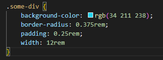
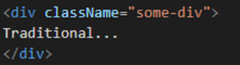
For instance, let’s say you have a <div> element and you wish to customize its background color, round the corners, set the width, and add some padding. Using the traditional approach, you would need to create a new CSS class and define all the styles you want to apply to that element. However, with Tailwind CSS, you can simply apply the predefined utility styles to achieve the desired effect.
Traditional way:
Tailwind:
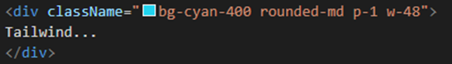
In this example we are using four of Tailwinds utility classes:
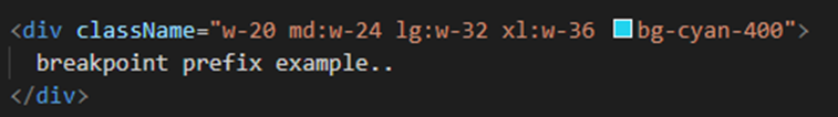
bg-cyan-400 The bg utility classes is for the background color, cyan is the color of the background and 400 is the colour weight.
rounded-md The rounded utility classes is used to apply a boarder radius, md (medium) is the size of the boarder radius.
p-1 The p utility classes are used to add padding to an element, the 1 is the size of the padding (1 in Tailwind is equal to 4px).
w-48 The w utility class is used to define the width of an element, the 48 is the size of the width (48 in Tailwind is equal to 192px).
Responsive Design: Adapting Websites for a Multi-Device World
One of the advantages of using Tailwind is its ease to implementing responsive design. Tailwind offers fully customizable breakpoint prefixes and allows for the conditional application of any utility class within the Tailwind framework.
The five default breakpoint prefixes provided should meet the requirements of most projects, as they have been carefully selected by Tailwind based on the most common device resolutions.
| Breakpoint prefix | Minimum width | CSS |
| sm | 640px | @media (min-width: 640px) { … } |
| md | 768px | @media (min-width: 768px) { … } |
| lg | 1024px | @media (min-width: 1024px) { … } |
| xl | 1280px | @media (min-width: 1280px) { … } |
| 2xl | 1536px | @media (min-width: 1536px) { … } |
In this example, a different Tailwind utility class will be used based on the screen size. “w-20” represents the default width, “w-32” is used for large screens, and “w-36” is used for extra-large screens.
Tailwind CSS Customization: From Default Styles to Custom Themes
When customizing Tailwind, you have the flexibility to extend the existing design system by defining your own utility classes or override Tailwind completely, allowing only the use of the utility classes you have defined. To customize Tailwind in the tailwind.config.js file, you can locate the theme section where you can add your customizations.
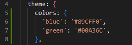
For instance, if you wanted to define a specific color palette for your design system, you would add a colors section within the theme section of the Tailwind configuration file. In this section, you can specify color names and their corresponding color values that you want to associate with each color.
In this example we have added custom colors for blue and green.
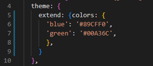
After adding the customizations to the theme, you can utilize the colors in the same manner as you would with Tailwind’s default colors. In the previous example, we directly added the color under the theme section. By doing this, the colors defined in the theme will be the only ones available for use, and the default colors provided by Tailwind will no longer be functional.
However, if you wish to incorporate custom colors while still benefiting from Tailwind’s default color palette, you can include your custom color within the extends section of the theme.
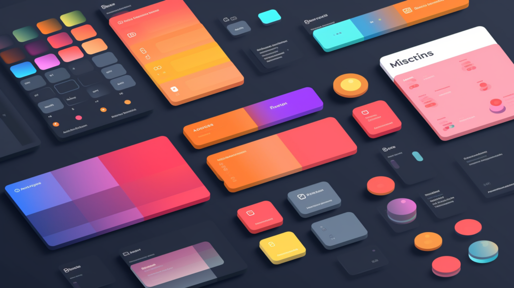
The Foundation: Key Components Included in the Initial Design System
We will maintain a simple initial design system for Massfaction and gradually enhance it as the project’s functionality and complexity expand. In the initial design system, we will establish the font, font sizes, and color palette. To determine sizing, padding, and margin, we will leverage the default settings offered by Tailwind. Additionally, we will employ the default screen size/breakpoint prefixes in the components we develop, ensuring that the site is responsive and adapts to different screen sizes.
Font Setup
I have selected the font “Oxygen” available at fonts.google.com to use on our site. To incorporate this font, we will begin by visiting Google Fonts and searching for the specific font. On the font’s page, we will choose the desired font variations that we want to import.
After choosing the desired font, navigate to the right side of the page and select the “Import” radio button.
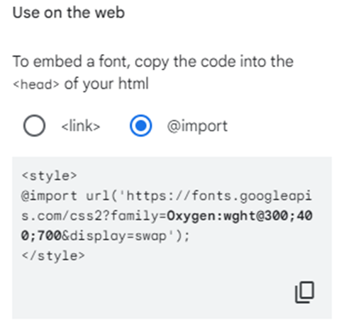
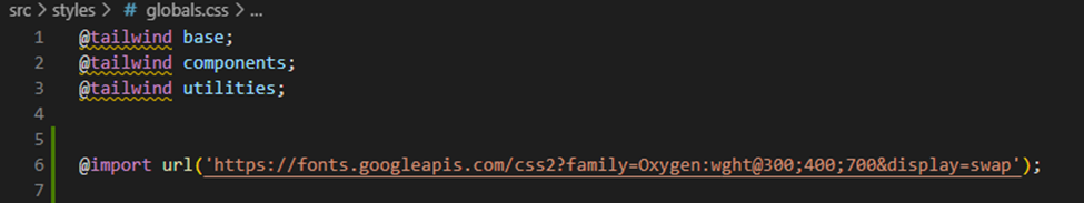
We will add the import code generated by Google to our global.css file.
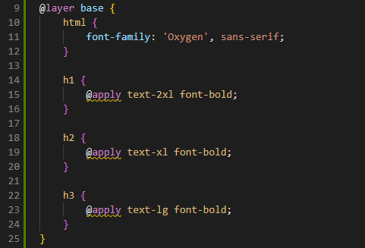
Next, we will add the CSS rules for the font below the import statement we previously added. Additionally, we will include some base styling for the header tags that we intend to use. To accomplish this, we will utilize the “@layer” directive to incorporate these styles into the tailwind base layer.
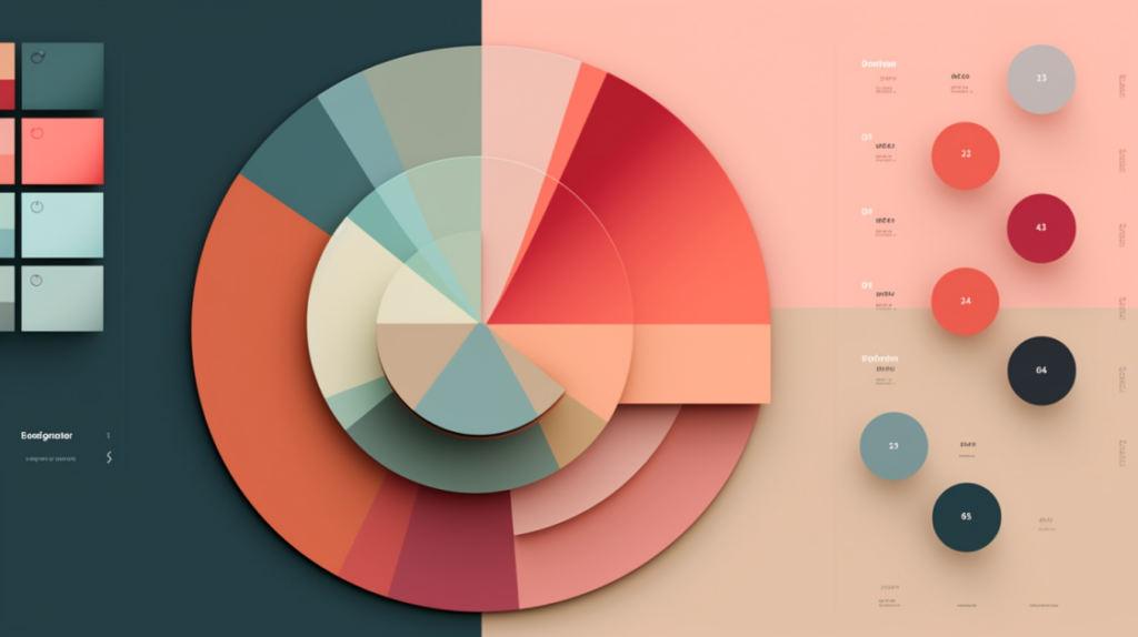
From Inspiration to Implementation: Picking Your Color Palette
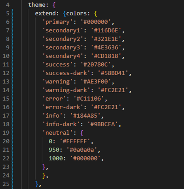
Now that we have set up the font for our site, the next crucial step is to establish the color palette for our design system. In the case of Massfaction, we will opt for a single primary color accompanied by a select set of secondary colors. Additionally, we will define a range of semantic colors that serve the purpose of conveying meaning and representing specific states within our design. As for the neutral colors, primarily in the grayscale, we will largely rely on the neutral colors provided by Tailwind, while also specifying a dedicated color for white and black. In a future post, we will delve into the process of implementing a dark theme for the site, during which we will determine the corresponding colors for the dark theme.
Primary Color
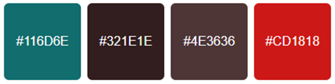
Secondary Colors
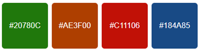
Semantic colors
Neutral colors
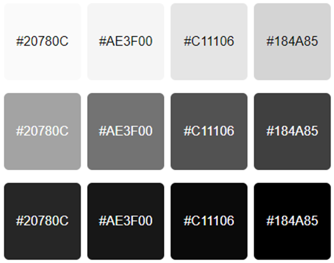
Now that we know which colors we want, we are going to add them to the Tailwind config file within the ‘extend’ section. This way, we can still utilize the default Tailwind colors if we decide to do so. I have also added versions of the semantic colors that will be used for the dark theme and pure white and black as additional neutral colors that are not included with the default neutral colors provided by Tailwind.
Component-Based Design
Since we will be developing this site using Next.js and React, we will leverage our defined design system to build components that maintain consistent visual styles. Additionally, we will utilize the Tailwind breakpoint prefixes within our components, ensuring responsiveness and adapting the components styling to match the user’s screen size. For instance, we will likely create a button component that can be used throughout the site, adjusting its size and other properties based on the screen size. If we want to make changes to the buttons across the site, we will only need to modify the Tailwind configuration, allowing us to update related design system styles or adjust the button component itself, reflecting the changes across all instances of the button on the site.
Whats Next
There is a considerable amount of additional work involved in fully developing a comprehensive design system. However, since this is a small hobby project, we will keep things simple and gradually build upon what we already have as the project progresses. In my next post, we will explore the overall concept of what Massfaction could potentially become and discuss the features and functionalities we plan to include in the minimum viable product (MVP).
Leave a Reply